


The Most Expensive Logo Ever Designed | Apple Logo History
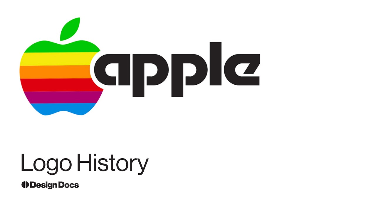
In 1977, Apple’s first CEO called it « the most expensive bloody logo ever designed. » Nearly fifty years later, it’s one of the most recognized symbols on earth, and almost everything people believe about it is wrong.
This documentary traces the Apple logo from Ron Wayne’s 1976 woodcut of Isaac Newton, to Rob Janoff’s bowl of apples at Regis McKenna, to the six-color stripes Steve Jobs retired in 1998 because they « felt like the 70s. »
Along the way: why the bite is really there, what Janoff says about the Alan Turing and « byte » theories, why the golden-ratio diagram doesn’t hold up, and how a trademark war with the Beatles’ Apple Corps ended up defining the logo in a legal contract.
Ways to support our channel:
Patreon: https://patreon.com/designdocs
Bookshop: https://bookshop.org/shop/DesignDocs
Other things:
Instagram: @bctld
Portfolio: SingleSpeed.us
Accéder à la chaine Youtube